dss_2024
Regulation of cone photoreceptor development
Featured scientist
Research Background
Cones are the photoreceptor cells responsible for color vision. They’re located in the retina of the eye.
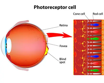
Early in the development cycle of a vertebrate embryo, eyes and their cones have not yet developed. The cells that will eventually become cones are undifferentiated, which means that they haven’t achieved their specialized functions yet. The developmental steps to becoming specialized involve biochemical signaling pathways. Signaling pathways tell cells to do things like cell proliferation “split into more cells”, cell differentiation “become this type of cell”, cell fate “stop making more cells”, or even cell death “tell them to die”.
Of the many signaling pathways, Notch signaling is especially important in the development of cone cells. Notch signaling involves communication between cells so the appropriate types and amounts of cells develop. Notch signaling performs all of the functions reported above- cell proliferation, cell differentiation, cell fate, and cell death. If Notch signaling goes awry, it can result in many types of disease, with some examples including cancer (too many of the wrong cell proliferating) and different types of retinal disease. Discovering which of these functions Notch signaling performs at specific points in the developmental process is crucial to treating disease.
To inform the development of therapies to treat retinal disease, Dr. Emerson and colleagues study the cellular development of vertebrate cone receptors. In the paper we’re investigating today, they uncover the role of Notch signaling in the development of cone photoreceptor cells Chen and Emerson (2021). The authors used genetic mechanisms to either inhibit or promote Notch signaling at different points in the cone cell development cycle. After performing their manipulation, they quantified the formation of different retinal cell types. This gave the authors clues as to how Notch signaling influences the progression from undifferentiated cells to specialized cone cells.
The method Dr. Emerson and colleagues used to inhibit Notch signaling was the MAML-DN protein construct. They inserted MAML-DN into undifferentiated retinal cells to see how inhibiting Notch signaling influences the formation of specialized cone cells. To make sure that MAML-DN is inhibiting Notch signaling, they used the Hes5::GFP reporter. This reporter activates when Notch signaling occurs. If MAML-DN is successful in inhibiting Notch signaling, the authors expect low levels of Hes5::GFP. This is the first step the authors take to investigate the role of Notch signaling in vertebrate cone formation.
Scientific Question
Does MAML-DN inhibit Notch signaling in vertebrate retinal cells?
Hypothesis
If MAML-DN inhibits Notch signaling, then we expect to detect lower amounts of the Hes5::GFP reporter in retinal cells.
Scientific Data
| treatment | perc_hes5 |
|---|---|
| Control | 7.019961 |
| Control | 10.389764 |
| Control | 12.221682 |
| Control | 4.435266 |
| MAML-DN | 2.329984 |
| MAML-DN | 2.927656 |
| MAML-DN | 2.773421 |
| MAML-DN | 7.332150 |
Table 1. Data used in the study. The ‘treatment’ column indicates the treatment applied to the retinal cells, while the ‘perc_hes5’ column indicates the percentage of cells in a culture detected with the Hes5::GFP reporter. Each observation is a replicate cell culture.
- What are the two treatment groups?
Data visualization
Data visualization is a critical component of the research process. Visualizing data shows you general trends in the data, any potential outliers or problematic observations, what the distribution of your data looks like, and more. While there are many ways to visualize data and a deep literature on visual design- the Fundamentals of Data Visualization by Claus Wilke is a great (free) introduction to the topic if you’re interested- we will focus on four main chart types:
-
Histogram
-
Scatterplot
-
Box and whisker
-
Bar plot
Histogram
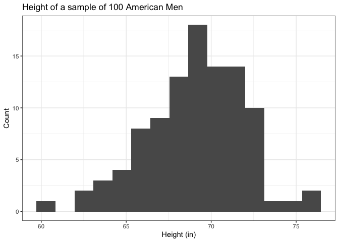
The histogram is designed to visualize a single, continuous variable. A continuous variable is obtained through measurements and can be any real number within a range. Things like height, weight, temperature, speed, etc. are all continuous variables. The height of the bars indicate the number of observations within a particular range. The width of the bin reflects the range of values within it and can significantly impact how you interpret the plot! There is no hard and fast rule to creating or interpreting them, other than to try to show the distribution of the data as accurately as possible and to always critically assess whether the plot is properly representing the data.
Scatterplot
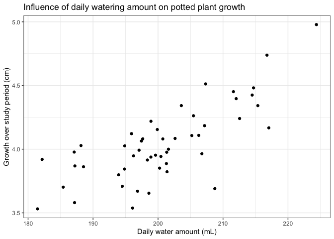
A scatterplot is designed to visualize the relationship between two continuous variables. Typically, the variable on the x-axis (horizontal axis) is an independent variable, while the variable on the y-axis is a dependent variable, although this doesn’t have to be the case. These can give you a quick idea of whether two variables are correlated and what sort of pattern their relationship follows (linear or non-linear).
Box and whisker plot
These are also known simply as “boxplots”. They are useful for comparing the distributions of groups of continuous variables. These are especially relevant in experiments when you are comparing multiple treatment groups. You can get a quick idea about if the middle or the range of values between different groups are different from each other. Each segment of a box and whisker plot have meaning, outlined below:
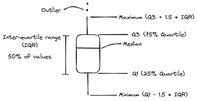
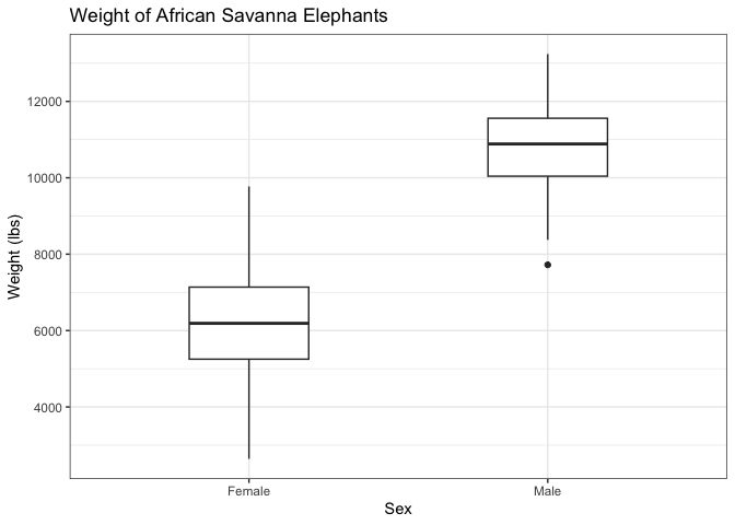
This gives you an idea about the distribution of variables without plotting every single data point. The median represents the middle, the IQR represents where half of the values are distributed, while the upper and lower whiskers represent extremes. Anything beyond the range of the whiskers is considered an outlier. Here is an example comparing male and female African Savanna Elephants:
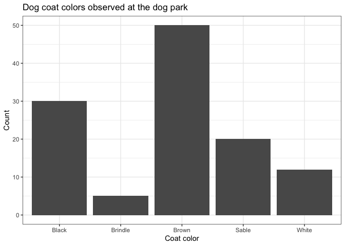
Bar plot
Bar plots are used to compare counts of discrete or categorical variables. Discrete variables are real numbers that can only take on certain values, while categorical variables are non-numeric groups. Both can be counted.
Excel exercise
In Excel, creating charts can be simple, but customizing them leaves you a lot of options. To create a chart:
- Select the data you would like to plot
- Insert > Select chart
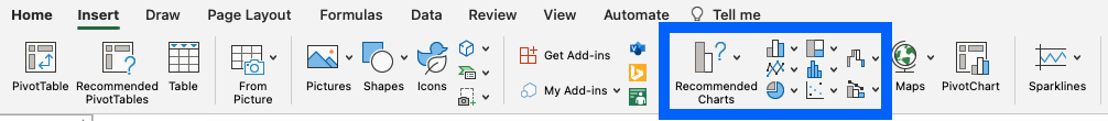
- Adjust chart elements
Most automatic charts that Excel generates will need some tweaking. For instance, this is what is automatically spit out when I select a scatterplot for that data:
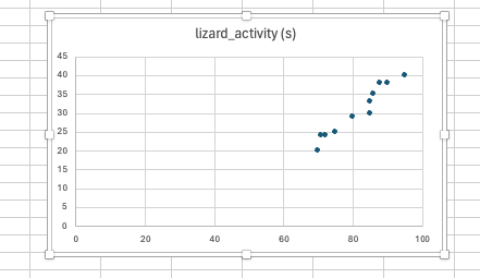
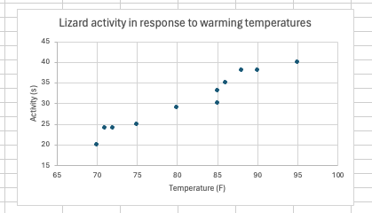
It needs a little work. The range of the axes is too long, the axes aren’t appropriately labeled, and the chart title isn’t informative. There are myriad ways to customize an Excel chart, and this YouTube tutorial does a pretty good job of going through the basics. It would take me a while to go through all of the options, and I will demonstrate some of the more important features live, but after playing around, you can achieve something like this:
For today’s exercise, you are going to make a box and whisker plot in Excel of Dr. Emerson and colleague’s data. The data is available as an Excel workbook on Blackboard.
Use the box and whisker plot to answer the following questions**. **Make sure to submit your Excel workbook along with the Lab worksheet to Blackboard.
Interpret the data
-
Based on the boxplot, does the data support the authors’ hypothesis?
-
Suppose you want to visualize the distribution of each treatment individually. What visualization technique (histogram, scatterplot, boxplot, or bar plot) would you use?
References
Before you leave
Fill out the Weekly Feedback Form.
Lab materials inspired by Data Nuggets.