dss_2024
Modeling the distribution of the spiny pocket mouse
Featured scientist
Research Background
Species distribution modeling is a way for scientists to predict where a particular plant or animal species might be found in a certain area. It uses information about the species’ preferred environmental conditions, like temperature, rainfall, and habitat type, to map out the areas that would be suitable for that species to live.
Imagine you have a favorite type of bird that you like to go birdwatching for. You probably know that this bird likes to live in certain types of forests or near bodies of water. Species distribution modeling works by taking all the places where this bird has been spotted before, and analyzing the environmental conditions of those locations. The model can then look at a larger geographic area and identify all the places that have a similar climate, vegetation, and other features that the bird needs to survive. This allows scientists to predict where else the bird might be found, even in areas where no one has actually seen it before.
Species distribution modeling is useful for conservation efforts, because it can help identify important habitats that need to be protected for endangered species. It can also be used to predict how climate change might affect a species’ range in the future, as the suitable environmental conditions shift over time. The key is that the model looks at the relationship between where a species is found and the environmental factors of those locations. By finding the pattern, it can then be applied to new areas to forecast potential habitats for that species. It’s a powerful tool for understanding and protecting biodiversity around the world.
For these reasons, Dr. Robert Anderson and colleagues used species distribution modeling to model the distribution of the South American spiny pocket mouse (Heteromys australis) Kass et al. (2021). They collected 20 localities where the mice have been observed from museum records and the literature, noting the longitude and latitude coordinates of each locality. They then extracted temperature and precipitation values for each locality, characterizing the environmental tolerances of the species. Using machine learning, they created a model based off of these tolerances and projected the model across the species’ range, creating a map of the predicted habitat suitability across the landscape. According to the species distribution model, most of the landscape is medium to high suitability.
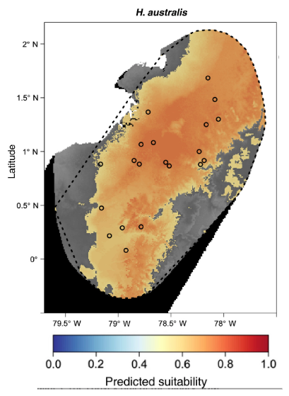
In addition to creating the habitat suitability map, the authors wanted to understand the environmental tolerances of the spiny pocket mouse. According to the literature, they are known to prefer areas that are wet and have a stable temperature across the year. If the literature is correct, the authors expect spiny pocket mice to inhabit areas that are wet and have low seasonal variation in temperature.
Scientific Question
- What is the question the authors are trying to answer?
Hypothesis
- State the authors’ hypothesis using the if… then… structure.
Scientific Data
| Suitability | Precipitation | Temperature Range |
|---|---|---|
| 0.76 | 25.13 | 6.82 |
| 0.84 | 27.94 | 14.98 |
| 0.83 | 24.76 | 6.99 |
| 0.47 | 13.94 | 8.54 |
| 0.75 | 26.80 | 6.23 |
| 0.88 | 29.51 | 12.31 |
| 0.54 | 20.32 | 9.41 |
| 0.83 | 34.68 | 12.31 |
| 0.90 | 29.93 | 2.00 |
| 0.47 | 15.07 | 7.10 |
| 0.98 | 20.85 | 16.09 |
| 0.85 | 36.52 | 16.80 |
| 0.89 | 25.04 | 7.44 |
| 0.51 | 24.95 | 3.01 |
| 0.42 | 14.22 | 13.87 |
| 0.92 | 34.03 | 1.64 |
| 0.95 | 28.35 | 6.66 |
| 0.48 | 16.59 | 7.77 |
| 0.69 | 21.76 | 3.62 |
| 0.68 | 19.86 | 8.62 |
Table 1. The data used in the study. Each of the observations represents a single locality. The ‘Suitability’ column is the habitat suitability value predicted for each observation. The ‘Precipitation’ column contains the average annual precipitation in centimeters. The ‘Temperature Range’ column indicates the maximum annual temperature subtracted by the minimum annual temperature in degrees Celsius.
What is regression analysis?
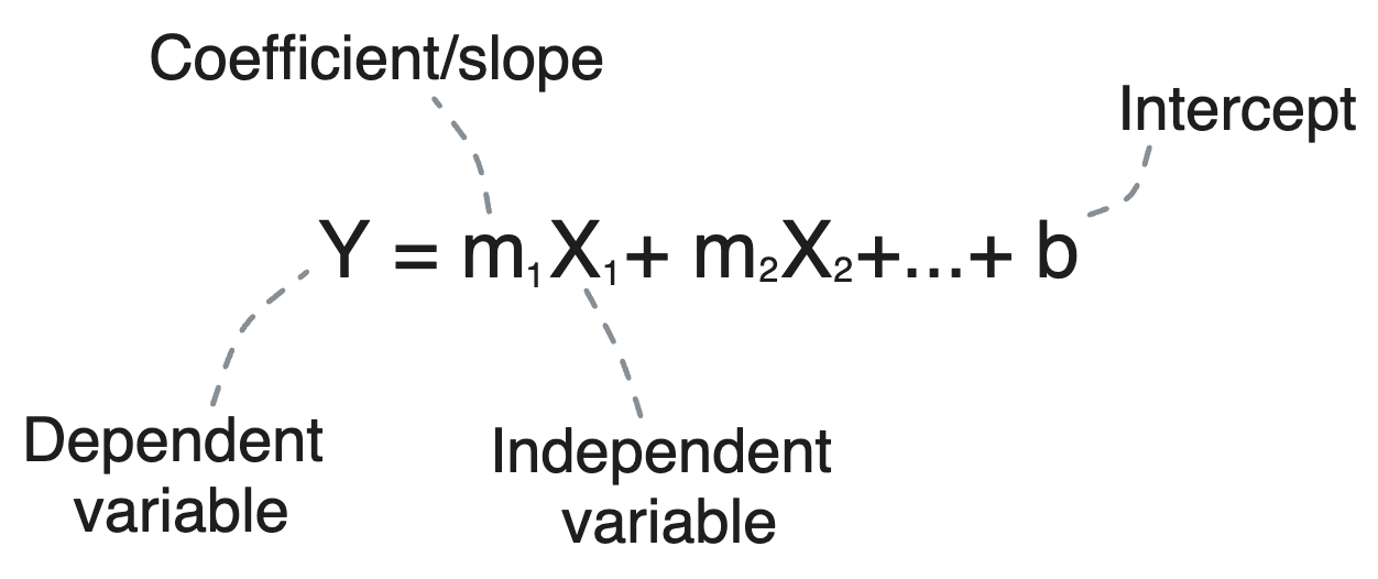
Regression analysis is an inferential statistics method that traces the relationship between a continuous dependent variable (what you’re trying to predict) and one or more continuous independent variables (the predictors). It quantifies this relationship through coefficients—numerical values that measure the strength and direction of these relationships. Each coefficient tells you the expected change in the dependent variable for a one-unit change in an independent variable, holding other variables constant. This mathematical modeling not only enables you to make predictions, but also to understand the underlying patterns in your data.
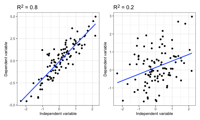
Two metrics in regression analysis that measure its predictive power are R2 (R-squared) and the p-value. R2 is a statistical measure that represents the proportion of variance for a dependent variable that’s explained by the independent variables in the model, essentially quantifying the model’s accuracy in explaining the observed outcomes. A higher R2 indicates a model that closely fits your data. To demonstrate R2 visually, here are two scatter plots with data sets containing a high R2 and a low R2, respectively:
The line is the “line of best fit”. This is a visualization of your model, where the slope of the line is equal to your coefficient (assuming your regression is only between two variables).
Meanwhile, the p-value assesses the significance of your results, helping you determine whether the observed relationships are statistically meaningful. As a reminder, a low p-value (typically less than 0.05) suggests that the relationship between your variables is not just due to chance. These concepts, crucial for validating your regression model, empower you with the ability to make statistically sound predictions and conclusions.
Regression analysis in Excel
To follow along, I’m using last week’s Excel Workbook for the examples.
Step 1: Use the Data Analysis Tool
- Access Data Analysis Tools: Click on the ‘Data’ tab in the ribbon, then click on ‘Data Analysis’ in the Analysis group. You should see it on the right side of the ribbon.

- Select Regression: In the Data Analysis dialog box, scroll down and select ‘Regression’, then click ‘OK’.
Step 2: Configure Your Regression
-
Input Y Range: Click in the ‘Input Y Range’ box and then select the range of your dependent variable data, including the label.
- Your dependent variable is “min_off”
-
Input X Range: Click in the ‘Input X Range’ box and then select the range of your independent variable data, including the label.
- You independent variable is “times_off”
-
Labels: Check the ‘Labels’ box if you included labels in your data range.
-
Output Options: Choose where you want Excel to place your regression analysis output. You can select a new worksheet ply, a new workbook, or a range within the existing sheet.
-
Residuals: Check the ‘Line Fit Plots’ to generate a scatterplot of your data with a line of best fit drawn through the middle. Note that the line may appear as a series of points and manual modification is necessary to turn it into a line. I can show you how in person, but it’s not necessary for interpretation.
This is what your final selections should look like:
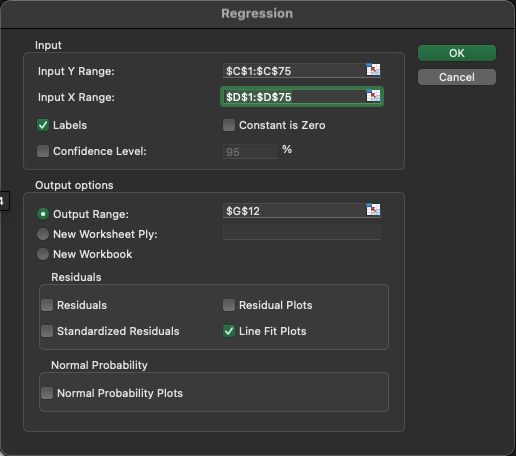
- Click ‘OK’: Excel will generate the regression analysis output.
Step 3: Interpret the Regression Output
The output may look overwhelming at first! But there are only a few values you need to focus on.
-
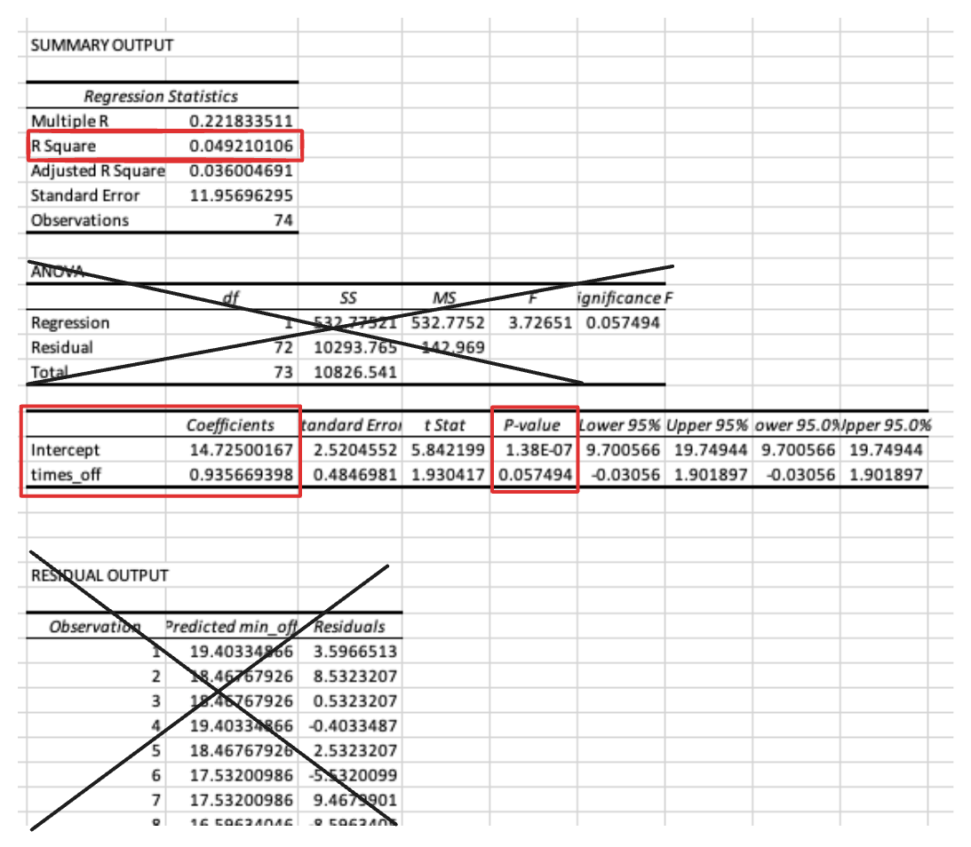
R Square (R²): Represents the proportion of the variance for the dependent variable that’s explained by the independent variable(s) in the model. As a rule of thumb, Low = 0.3 < R2 < 0.5, Moderate = 0.5 < R2 < 0.7, High = 0.7 < R2.
- In this case, the R2 is negligible- 0.05 is lower than the Low threshold!
-
Coefficients: These values tell you about the relationship between each independent variable and the dependent variable. The coefficient of the independent variable shows the change in the dependent variable for one unit change in the independent variable, assuming all other variables remain constant. You only interpret these if the coefficient is statistically significant. Don’t worry about the intercept- there only a few circumstances where you might be interested in the intercept.
- In this case, the coefficient is not statistically significant (p-value = 0.057 > 0.05), but if it were significant, we would interpret the coefficient as “for every time the female left the nest, the females spend 0.94 more minutes off of the nest”.
-
P-value: Helps you understand the significance of your model’s predictors. A p-value less than 0.05 is typically considered statistically significant.
- as stated above, the coefficient is not statistically significant (p-value = 0.057 > 0.05)
Excel exercise
This week, you will conduct a regression analysis to address Dr. Anderson and colleagues’ hypothesis. The dependent variable will be Suitability, while the independent variables will be Precipitation and Temperature Range. The data is available on Blackboard.
- Conduct a regression analysis, including Line Fit Plots.
Answer the following question about the data:
- What are the p-values for each predictor? Based on an alpha value of 0.05, do you reject or fail to reject the null hypothesis that there is no relationship between the predictor and Suitability (answer for each predictor)?
- What are the coefficients for any predictor(s) that are statistically significant? How would you interpret the coefficient?
- What is the R Square of the regression? Based on the following guidelines, is the R Square low, moderate, or high? Low = 0.3 < R2 < 0.5, Moderate = 0.5 < R2 < 0.7, High = 0.7 < R2
- Do these results support the authors’ hypothesis? Why or why not?
After you’re finished, upload the workbook and the lab worksheet to Blackboard.
References
Before you leave
Fill out the Weekly Feedback Form.
Lab materials inspired by Data Nuggets.